

Design System
System for Success
Purpose of Design System
Established and maintained a Design System for a design team to promote consistency, efficiency, scalability, collaboration, and a superior user experience across all its products and services. It serves as a foundational element for design and development efforts, contributing to the overall success and cohesion of the company's digital presence.
Site Audit: For many weeks, I dedicated my time in auditing the current design/website. Meticulously documenting its current elements, identifying inconsistencies, and pinpointing areas where the user experience could be enhanced.
Role UX/UI Designer
Tools. Figma, Sketch
Goals Bring uniformity in design/website
The Approach
Our approach drew inspiration from the principles of the Atomic Design methodology. Our design team aimed to develop a system capable of swiftly generating various versions of our application in multiple sizes. This system needed to strike a balance between creative freedom and brand consistency. Nonetheless, it was crucial to create a controlled environment to ensure that the design remained on-brand and adhered to a cohesive conceptual and visual pattern.
What is Atomic Design?
Atomic Design is a methodology inspired by chemistry created by Brad Frost. Just as all matter is made out of atoms that combine to form molecules, which in turn make up more complex organisms; Atomic Design involves breaking an interface down into its basic components and then working up from there to create a cohesive design system.
The basic idea is to separate and organize each design element and build more complex layouts using smaller parts.

Diagram reference: https://atomicdesign.bradfrost.com/chapter-2/
Project Goals
-
Unifies the digital platform created across a set guideline.
-
The design decision simplifies with the structured system.
-
Visual consistency makes it more adaptable across the platforms.
-
Interfaces become more scalable and get adapted to larger systems.
Step 1- Atoms
Breaking the larger platforms and features into the smaller functional components and label as sub-components
Create a standardized pattern library and rebuild it into increasingly larger components.
Use these sub-components to mix and match and reconfigure endlessly.
What it offers:
-
Visual integrity in a platform
-
Simplified flows that enable faster debugging capabilities
-
Achieve responsiveness across multiple device platforms
-
Organizations standardize the branding across the ecosystem
It is a component-based design option that uses the same analogy from chemistry, where the atomic units bonds together to make a larger molecule and in turn combine to make more complex organisms.
Color Palette


Typography


Buttons


Icons


Step 2 - Molecules
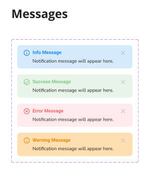
Consists of multiple atoms combined. It can be classified as a form paired with a button, search bars, forms, cards, navigation menus, or another component that can be reused. The idea is to reuse the molecule across multiple times on the site.


Step 3 - Organisms
Combining multiple molecules makes the organism. It can be correlated to the UI interface for example a footer, a menu, a feature selection, a product listing, or even the content grid.
Grid & Spacing


Result
Design systems are living, evolving ecosystems. What I’ve presented here is just a glimpse of the larger system at play. A complete design system typically includes:
-
Documentation: A central hub that explains when and how to use the system effectively.
-
Templates: Grouping multiple organisms and reusing them across the page site makes it a reusable template. Content structuring can be achieved by a modular approach of templates and help find useful responsive design.
-
Pages: A combination of templates with developer-generated content makes a page represent the final outlook.
-
Brand Guidelines: Outlines brand principles, tone of voice, writing style, and more to ensure consistency.
-
Plug-ins: A way to provide flexibility and extensibility of logic in a very isolated environment. These are software additions that can be added to an app or the web browser and make the functionality more scalable across applications. Examples could be accessing maps, opening special document extensions like PDF, or adding online print services, etc.
-
CSS Framework: The foundational front-end code that developers use to implement the design seamlessly.
Publish Library & Train Users